Introduction
A plain guide to IC Konsole — what each column shows, what it tends to mean, and how you might use it.
Start: The Konsole grid · Column dictionary: Full reference
Authoring reference for future chapters: konsole/_TEMPLATE.md · Checklist: konsole/README.md
(Chart · Sandbox — later)
The Konsole grid
The Konsole is the scanner table below the chart: one row per symbol, columns for participation, BTC coupling, structure, trend energy, open interest, and your notes.
Konsole header row
Left to right, the grid groups into:
| Group | Columns |
|---|---|
| Symbol & liquidity | Ticker, MC, ★ |
| Phase tier | Tier |
| Volume ratios | P, D-P |
| BTC stats | R, β |
| Structure | 2D, 1W |
| Volatility | Vol |
| 4-hour trend | 4H, σ |
| Positioning | OI |
| Timing | 1st |
| Notes | Notes |
Takeaway: Short-term columns refresh from fifteen-minute data; structure and 4H energy use four-hour history; open interest updates about hourly.
What
Konsole is a ranked watchboard — not a chart. Each cell compresses one idea (e.g. “volume vs normal for this time of day”) so you can scan many symbols without switching charts.
So what
Rows you care about usually show coherence: tier label (P1–P3), elevated P and D-P, structure colour matching your bias, and OI / σ telling you whether the move is fresh or crowded.
Now what
Start with the full column dictionary: Konsole columns — full reference — every header, formula, and display rule in one place.
Then drill into topic chapters (structure, coupling, tiers) from the sidebar, or run TOP CMC / your watchlist from Watchlist & TOP CMC.
Konsole columns — full reference
Every column in the Konsole grid: what it measures and how to read the cell. Use this as the lookup when a header label is unclear.
Takeaway: P, D-P, R, β, Vol, and Tier update from 15-minute bars. Structure (2D, 1W), trend strength (4H, σ), and open interest refresh on slower cadences.
Shared ideas
| Concept | Meaning |
|---|---|
| Time-of-day baseline | Each UTC day split into 96 fifteen-minute slots. Typical volume/volatility learned per slot from ~10 days of history. 2.50x = 2.5× normal for that exact time. |
| BTC coupling window | Last 96 aligned 15-minute bars (~24h) of log-returns vs BTC. Used by R and β. |
| Tier persistence | First P1/P2/P3 hit of the UTC day is stored until midnight. 1st shows how long ago. |
Column index
| Header | Name | Format |
|---|---|---|
| Ticker | Symbol | Text — click to load chart |
| MC | Market cap | Compact USD (k / m / B) |
| ★ | Watchlist | Star on / off |
| Tier | Phase sync | P1, P2, P3, or blank |
| P | Slot participation | e.g. 2.50x |
| D-P | Day participation | e.g. 3.20x |
| (R) | BTC correlation | −1 … +1 |
| 2D | 48h structure | Sparkline + color |
| 1W | 7-day structure | Sparkline + color |
| (β) | BTC beta | Decimal |
| Vol | Volatility ratio | e.g. 1.50x |
| 4H | Trend strength | Histogram sparkline |
| σ | Energy z-score | e.g. +1.8σ |
| OI | Open interest | Score −5 … +4 |
| 1st | First tier hit | Age e.g. 45m, 3H |
| Notes | Your notes | Free text |
Ticker
What it is. Symbol name for the row.
- Click to open that symbol on the chart.
MC (market cap)
What it is. Market cap in USD, compact form (500m, 1.2B).
- Looked up from an external snapshot — not computed live.
- MIN filter takes millions (
100= at least $100M).
★ (watchlist)
What it is. Favorites toggle. ★ = on list, ☆ = off.
- Single click header: favorites first.
- Double click header: favorites only.
Tier
What it is. Phase-sync gate on today’s participation. Only P1, P2, P3 show; everything else is blank.
| Tier | Color | Requires |
|---|---|---|
| P1 | P ≥ 2.5, D-P ≥ 5.0, P > D-P | |
| P2 | D-P ≥ 3.0, P ≥ 1.5 | |
| P3 | D-P ≥ 2.0, P ≥ 1.0, P > D-P |
Takeaway: A phase-sync gate, not a forecast.
P (participation — slot)
What it is. Latest closed 15-minute bar’s volume vs. normal for this time of day. One color (green), increasing in strength.
| P | Color |
|---|---|
| < 2× | Neutral |
| 2× – 5× | |
| 5× – 7× | |
| 7× – 10× | |
| ≥ 10× |
D-P (day participation)
What it is. Volume from UTC midnight to now vs. the average of prior days over the same elapsed time. Same green scale as P.
Takeaway: P is this slot right now; D-P is the whole day so far vs. history.
(R) — BTC correlation
What it is. How closely 15-minute returns track Bitcoin, over the last ~24h. Green when positive, red when negative — deeper color the further from zero.
| R | Color |
|---|---|
| +1 (lockstep) | |
| 0 (unrelated) | |
| −1 (inverse) |
- Color fades in below ~0.25 — weak coupling stays plain.
2D (48-hour structure)
What it is. Sparkline of the last 12 four-hour closes (~48h). Endpoint comparison only — no pivots or patterns.

| Color | Meaning |
|---|---|
| Green | Last close > first close |
| Red | Last close < first close |
| Orange | Flat endpoints |
1W (7-day structure)
What it is. Same idea as 2D, on the last 7 daily closes (built from 4H bars). Same color table as 2D.
(β) — BTC beta
What it is. How much the altcoin amplifies Bitcoin’s moves, same window as (R). Always green — strongest near β ≈ 2.2, fades out at low beta.
| β | Color | Meaning |
|---|---|---|
| ≈ 1 | Moves like BTC | |
| ≈ 2.2 | Amplifies (strongest color) | |
| < 1 | Dampens (fades to plain) |
Vol (volatility ratio)
What it is. Price volatility (candle range + open/close), not volume, vs. the time-of-day norm. Shown as text color, not a cell background — one color (gold), increasing in strength.
| Vol | Color |
|---|---|
| < 3× | Plain text |
| 3× – 4× | 1.50x |
| 4× – 5× | 1.50x |
| ≥ 5× | 1.50x (bold) |
4H (trend strength)
What it is. Histogram of how far price sits from its 200-period 4H average, smoothed and filtered.
- Deviation from the 200-period average.
- Smoothed over 5 bars.
- Small wiggles filtered out.
- Bullish tint above the average, bearish tint below.
- Gold marker = historical median. Colored marker = today’s reading.
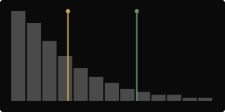
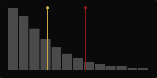
Minimum history: ~219 closed 4H bars.
σ (sigma — energy z-score)
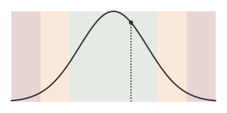
What it is. How extreme today’s 4H trend energy is vs. its own history.
| σ | Color | Meaning |
|---|---|---|
| < 1.5 | Green | Normal |
| 1.5 – 2.5 | Orange | Elevated |
| ≥ 2.5 | Red | Extreme |
- Needs ~50 stored readings; otherwise blank.
Takeaway: 4H shows the shape of the distribution; σ gives the number on that scale.
OI (open interest)
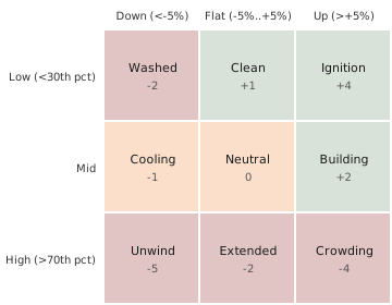
What it is. Positioning score from OI’s percentile in its own history, crossed with its 24h % change.
- Refreshes about hourly.
1st (first tier hit)
What it is. How long ago the symbol first hit P1, P2, or P3 today — not the clock time.
| Age since first hit | Shown as |
|---|---|
| < 2 hours | Minutes (45m) |
| ≥ 2 hours | Hours (3H) |
| No tier hit today | Blank |
Notes
What it is. Your per-symbol text field. Saved locally, not derived from market data.
How columns relate
| Feed | Columns |
|---|---|
| 15m stream | P, D-P, R, β, Vol, Tier |
| 4H feed | 2D, 1W, 4H histogram, σ |
| External | MC, OI |
| User | ★, Notes |
What
The Konsole grid is a multi-timeframe participation and structure board: slot and day volume (P, D-P), BTC coupling (R, β), price structure (2D, 1W), trend energy (4H, σ), positioning (OI), liquidity rank (MC), and tier gates (Tier, 1st).
So what
Aligned participation. P, D-P, and Tier lining up (especially P1) means unusual activity that’s both intraday and day-so-far — not a single isolated spike.
Coupling context. High P with high R and β suggests a BTC-led tape. Low R with high P suggests idiosyncratic flow.
Structure vs. energy. 2D / 1W answer “which direction did closes go.” 4H / σ answer “how stretched is this vs. its own trend history.”
Now what
Decode a row before opening the chart: Tier / 1st for timing, P / D-P / Vol for participation, R / β for BTC linkage, 2D / 1W for structure, 4H / σ / OI for extension and positioning. The grid is context, not a signal service — entries and exits stay yours.
For tier playbooks, see Tier playbook. Narrative chapters live in the sections linked from The Konsole grid.
Watchlist & TOP CMC
What
Two ways to fill the grid, switched with the toggle above it. Watchlist shows the symbols already on your chart’s watchlist. TOP CMC scans the top 300 symbols by market cap — a full pass typically takes 1 to 3 minutes.
So what
Watchlist is your shortlist, refreshed on demand — fast, and limited to names you’ve already chosen to track. TOP CMC is a discovery scan across a much wider universe — slower, but it can surface a tier hit or a spike on a symbol you weren’t already watching.
Now what
Use Watchlist for the daily routine on names you track — double-click the header to rescan baselines without waiting for the next cycle. Switch to TOP CMC when you want to find something new; double-click there to force an immediate rescan instead of the scheduled one. While a scan runs, the grid keeps showing its last results until the new pass lands.
Macro panel (BTC / ETH)
The same cells, fixed on BTC and ETH
The macro panel is two fixed cards, one for BTC and one for ETH, sitting beside the grid regardless of what the grid itself is scanning. Each card shows that asset’s live price, its 2D and 1W structure sparklines, and its 1D and 4H energy readings with sigma — the same cells used throughout the grid, just permanently pinned to the two assets everything else gets measured against.
Takeaway: This is BTC and ETH’s own row, always visible, whether the grid is showing your watchlist or a TOP CMC scan.
What
Two cards, BTC and ETH, each independent of the main grid: price, 2D/1W structure, and 1D/4H energy with sigma.
So what
Every symbol’s R and β are measured against BTC. The macro panel is where you check what BTC itself is doing — trending, stretched, or flat — without switching charts or losing your place in the grid.
Now what
Check the macro panel before leaning hard on a high-β, high-R symbol: if BTC’s own structure and energy are already stretched, a strongly coupled altcoin is riding that same extension, not creating a fresh move of its own.
2 Day Structure
Bullish — net higher over 48h
Twelve four-hour closes, oldest to newest. The last close sits above the first, so the cell reads green — nothing more than an endpoint comparison.
Takeaway: Green here means “ended the window higher than it started,” not “trended cleanly the whole way.”
Bearish — net lower over 48h

Same twelve closes, opposite outcome: the last sits below the first, so the cell reads red.
Mixed — flat endpoints

The window moved in both directions but ended close to where it started, so the cell reads orange — genuine movement, no net direction.
What
2D is a sparkline of the last twelve four-hour closes (~48 hours), colored by comparing only the first and last point. No pivots, no pattern matching — just where it ended up versus where it began.
So what
Because it’s an endpoint comparison, a 2D reading can look calm even after a sharp round trip in the middle — the mixed example above is exactly that case. The color tells you net direction, not the path taken to get there.
Now what
Use 2D as a quick directional filter before opening the chart, not as the whole read. Pair it with 1W for the longer window, or open the chart directly when the shape matters as much as the endpoint.
7 Day Structure
Bullish — net higher over 7 days

Seven daily closes, each one the last four-hour close of that UTC day. Last above first reads green — same rule as 2D, on a longer window.
Takeaway: 1W is the week’s shape; 2D is the last two days of it.
Bearish — net lower over 7 days

Last below first reads red.
Mixed — flat endpoints

A week that moved both ways and landed back near where it started reads orange.
What
1W is the same sparkline idea as 2D, built from seven daily closes instead of twelve four-hour closes. Same green/red/orange rule, just a longer window.
So what
1W smooths out the noise a single 2D swing can carry — a symbol can show red on 2D while 1W still reads green, if the last two days are a pullback inside a longer uptrend. Reading both together tells you whether a short-term move agrees with the larger week or fights it.
Now what
See Reading 2D + 1W for how the two combine in practice.
Reading 2D + 1W
Aligned — both green
The last two days and the last seven days both closed higher than they opened. The short-term move has the longer window behind it.
Takeaway: Agreement between 2D and 1W is the cleanest read the structure columns can give you.
Divergent — 2D and 1W disagree
2D red inside a 1W that’s still green usually reads as a pullback inside a longer uptrend, not a reversal — though only the chart can tell you which one it actually is.
What
2D and 1W are the same endpoint rule on two windows: 48 hours and 7 days. Reading them together is checking whether a short-term move agrees with the longer one it sits inside.
So what
Aligned colors mean the short-term move is riding the longer trend. Divergent colors mean one of two things — an early reversal, or a normal pullback that hasn’t changed the bigger picture yet. Structure alone can’t tell you which; it just tells you there’s a question worth checking on the chart.
Now what
Treat alignment as a green light to keep using the rest of the grid with more confidence. Treat divergence as a cue to open the chart before leaning on Tier or 4H readings for this symbol — the structure columns are telling you the picture is mixed.
BTC Correlation (R)
Flat in the middle, color at the edges
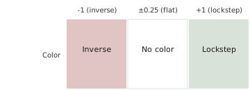
R sits between -1 and +1. Inside a small band around zero, it shows no color at all — the coin isn’t meaningfully tracking or fighting Bitcoin. Past that band, green grows toward +1 and red grows toward -1.
Takeaway: A plain cell here means genuinely uncoupled, not “weakly positive” or “weakly negative.”
What
R measures how closely this coin’s 15-minute returns have moved with Bitcoin over the last ~24 hours. +1 is lockstep, 0 is unrelated, -1 is inverse.
So what
High R with a strong move usually means the coin is riding a BTC-led tape, not doing something of its own. Low R with a strong move suggests the story is idiosyncratic to this symbol — worth a second look at why it’s moving on its own.
Now what
Pair R with Beta: R tells you whether the coin is following BTC at all, β tells you by how much. A high-R, high-β symbol on a big BTC day is mostly BTC’s move wearing this symbol’s ticker.
Beta (β)
Strongest color around 2.2
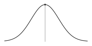
β measures how much this coin amplifies Bitcoin’s moves, over the same window as R. The color gets stronger the closer β sits to 2.2, and fades out toward 1 and below.
Takeaway: β near 1 means “moves like BTC.” The highlight is reserved for coins amplifying well past that.
What
β is how much this coin’s moves are magnified versus Bitcoin’s, using the same aligned returns as R. β ≈ 1 moves like BTC, above 1 amplifies, below 1 dampens.
So what
A high-β symbol turns an ordinary BTC day into a bigger move on this ticker — and an ordinary BTC pullback into a bigger pullback too. β doesn’t care about direction, only magnitude.
Now what
High β raises both the reward and the risk of anything BTC does next — position size should account for that amplification either way. Check R alongside it: high β with low R means the amplification claim doesn’t actually apply right now, since the coin isn’t tracking BTC closely enough for β to mean much.
Participation (P)
A slot spike vs. its own baseline
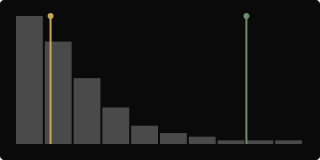
Distribution of how this symbol’s last-15-minute volume usually compares to normal for this exact time of day. Most readings sit near the baseline; today’s sits out in the thin tail.
Takeaway: The further out in the tail today’s reading sits, the more unusual this slot is for this symbol, at this time of day.
What
P compares the volume on the latest closed 15-minute bar to what’s normal for this exact UTC time slot. Shown as a multiplier — 2.50x is 2.5 times the usual amount for right now.
So what
A high P means something changed in the last 15 minutes specifically — not necessarily all day. On its own it can be a false start; paired with D-P moving the same way, it starts to look like a real shift rather than a blip.
Now what
A P spike with a flat D-P is worth watching, not acting on — it may fade as fast as it appeared. A P spike alongside a rising D-P is the combination Tier is built to catch.
Day participation (D-P)
A heavy day vs. prior days
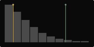
Distribution of how this symbol’s volume-so-far usually compares to prior days at the same point in the day. Most days cluster near the baseline; today sits well out toward the heavy end.
Takeaway: This isn’t one loud bar — it’s the whole day running heavier than usual, start to now.
What
D-P compares cumulative volume from UTC midnight to now against the average of prior days over that same elapsed time. Shown as a multiplier, same scale as P.
So what
Where P is “right now, this slot,” D-P is “the whole day so far, against history.” A single P spike can be noise; a D-P that’s been elevated for hours is a day that’s genuinely busier than normal, not a one-bar blip.
Now what
D-P elevated on its own says the day is busy — it doesn’t say why or which direction. Check P for whether that business is concentrated right now or spread through the day, and Tier for whether the two are lining up.
Volatility (Vol)
A tight session
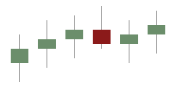
Narrow candle ranges, small bodies. Below 1x, this symbol is moving less than its own usual amount for this time of day.
Takeaway: Quiet isn’t neutral — it’s a measurable below-normal reading, same scale as an elevated one.
An expanded session
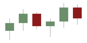
Wide candle ranges, bigger bodies. Above 1x, this symbol is moving more than its own usual amount for this time of day.
Takeaway: This is range and open/close behavior, not raw volume — Vol and P can move independently.
What
Vol compares current price volatility — candle range plus open/close behavior — to the time-of-day norm for this symbol. Shown as a multiplier and, on the grid, as text color: gold that gets stronger and eventually bold from 3x up.
So what
Vol answers “how much is this thing actually moving,” separate from “how much volume is trading” (P, D-P) and separate from “which way is it going” (2D, 1W). A quiet Vol reading during a P spike is its own kind of tell — volume without range expansion.
Now what
Low Vol can mean a level is being tested quietly, or that nothing is happening yet — context decides which. High Vol means stops and targets sized for a normal session may be too tight; give the range more room or expect it to close faster than usual.
Tier
Where P and D-P land
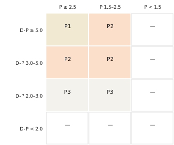
P1, P2, and P3 are three different combinations of slot participation and day participation, each stricter than the last. P1 and P3 also need this slot’s participation to be running ahead of the day’s — the zones above are the general shape, not the exact edge case.
Takeaway: Tier isn’t one number crossing one line — it’s two numbers agreeing.
What
Tier is a phase-sync gate: it checks whether P and D-P are elevated together, today, in a specific combination. Only P1, P2, or P3 show in the cell — anything short of those three combinations leaves it blank.
So what
P1 is the strictest: both slot and day volume are running hot, with the current slot leading the day. P2 relaxes that — a genuinely busy day is enough on its own. P3 is the loosest qualifying combination, still meaningfully above normal on both counts. Blank doesn’t mean quiet, it just means this specific combination hasn’t fired.
Now what
P1 is worth the most attention precisely because it’s the hardest to reach by accident. P2 and P3 are still real signal, just with lower bars — cross-check Vol or 4H before deciding how much weight to give a P3 on its own. 1st tells you how long ago the tier first fired today, which matters as much as which tier it is.
4H trend strength
Energy above the median — price above its 200-period average
A histogram of how far price has been sitting from its own 200-period four-hour average, smoothed and filtered to cut out small noise. The marker shows today’s reading sitting well above the middle of its own history, with price trading above that average.
Takeaway: The trend has been running further from its average than usual, and the tape is on the upside of it.
Energy above the median — price below its 200-period average
Same picture, other side: today’s reading is elevated against its own history, but price is trading below its 200-period average.
Takeaway: Same stretched reading, opposite side — the trend running further from average has been to the downside.
What
The 4H column shows a distribution histogram of how far price has been deviating from its own 200-bar four-hour average — the shape of that history, plus a marker for where today sits against it. It needs about 224 closed four-hour bars before it fills in, since it’s built on a 200-period average plus smoothing.
So what
Where today’s reading falls in this histogram tells you whether the current trend is running a normal distance from its average or has stretched further than usual. The marker’s tint just tells you which side of the average price is on right now — it isn’t a separate reading, it’s context for the same number.
Now what
A reading near the middle of the histogram is unremarkable — nothing about today’s trend distance stands out. A reading pushed out toward the edge is worth cross-checking against Sigma, which turns this same distribution into a single number — that’s usually the faster read once you know what the shape behind it looks like.
Sigma (σ)
The calm-to-stretched curve
A score for today’s 4H trend energy against its own trailing history — built to resist getting dragged around by a handful of wild outliers. A typical reading sits inside the green band, close to the peak.
Takeaway: Most of the time this number sits well inside the middle band — that’s the boring, expected case.
An extreme reading
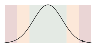
Past 2.5, the reading is out past the shoulder of the curve entirely — today’s trend energy is far outside its own normal range for this symbol.
Takeaway: This is the stretched end of the scale — the trend has gone further from normal than it usually does.
What
Sigma turns the 4H energy histogram into one number: how far today’s reading sits from its own middle, on a scale where 1 unit is a typical amount of spread. Under 1.5 is the green, ideal band; 1.5 to 2.5 is orange, less ideal; 2.5 and beyond is red, extreme. It needs about 50 stored energy readings before it’s reliable.
So what
Sigma is the single-number version of the 4H histogram — the same underlying reading, condensed to one scale so you don’t have to eyeball where the marker sits in the distribution. A green reading says nothing unusual; orange says the trend has stretched further than normal; red says it’s stretched about as far as this symbol’s own history has ever seen.
Now what
A red reading is where “the trend is extended, reduce or wait for a reset” ideas come from — not from a fixed rule, but because this tape’s own history says a distance this large rarely holds. A green reading means Sigma isn’t adding a reason to hesitate on a setup built from the other columns.
Open interest (OI)
Positioning against the last 24 hours
Where open interest sits in its own history — low, mid, high — crossed with how much it moved in the last 24 hours — down, flat, up. Each combination gets a name and a score from +4 to -5.
Takeaway: The same OI level means something different depending on whether it’s rising, falling, or holding — the grid is what tells them apart.
What
OI compares two things: the percentile of current open interest against its own recent history, and the percent change over the last 24 hours. Crossing those gives nine named states — Ignition, Building, Clean, Neutral, Cooling, Extended, Washed, Crowding, Unwind — each carrying a score from +4 (Ignition) down to -5 (Unwind). It refreshes roughly hourly.
So what
Low OI with a fresh 24-hour increase (Ignition) reads very differently from high OI with a fresh 24-hour increase (Crowding) — the first is new positioning coming into a relatively empty book, the second is more positioning piling onto a book that’s already full. Same direction of change, opposite meaning, because the starting level is different.
Now what
Ignition and Building are where “fresh interest, room to run” ideas come from. Crowding and Unwind are where “this move is more full than it looks” caution comes from — a lot of positioning has already piled in, or is actively leaving. Neutral, Cooling, and Extended sit in between and usually defer to whatever the other columns are saying.
Market cap (MC)
What
MC shows estimated market capitalization in US dollars, in compact form (500m, 1.2B). It’s looked up from an external snapshot, not computed live inside Konsole.
So what
MC is a liquidity filter, not a signal. A tiny-cap symbol lighting up P1 behaves very differently from a large-cap doing the same — smaller caps move further on the same relative volume.
Now what
Use the MIN filter under MC to set a liquidity floor before you scan (100 = at least $100M), so the grid isn’t full of names too thin to trade the size you want.
First tier hit (1st)
What
1st shows how long ago this symbol first hit P1, P2, or P3 today — not the clock time. Under 2 hours shows as minutes (45m); 2 hours or more shows as hours (3H); no hit today is blank.
So what
A young 1st means the tier just fired — you’re looking at it near the start of whatever’s happening. An old 1st means the tier fired hours ago; the symbol has been sitting in tier territory for a while, which is a different situation than a fresh trigger even if the Tier label is identical.
Now what
Fresh tier hits are worth a first look before older ones — not because older is worse, but because a young 1st is closer to the decision point that got the symbol here. An old 1st paired with the same tier all day is a candidate for Notes rather than a repeat scan.
Notes
What
Notes is a free-text field per symbol, saved locally with the app. Nothing in it is derived from market data.
So what
Every other column resets with the market; Notes is the one place your own read on a symbol persists — why you’re watching it, what you decided last time, what to check next.
Now what
Use it for anything the grid can’t hold: a level you’re watching, a reason you passed on a setup, a reminder for next time this symbol’s tier fires again.
Tier playbook
The three zones, side by side
P1, P2, and P3 aren’t three severities of the same thing — they’re three different combinations of slot and day participation, each one a genuinely different situation to be looking at.
Takeaway: Which tier fired changes what else is worth checking, not just how loudly to pay attention.
What
Tier is the entry point into a scan: one label summarizing whether today’s participation is aligned, and how strictly. Everything else on the row — Vol, structure, 4H, OI — is context for what that tier actually means for this symbol right now.
So what
A P1 is rare enough that it’s usually worth a look on its own, but Vol and 4H tell you whether the move behind it is expanding or already stretched. A P2 or P3 benefits more from corroboration — structure agreeing, or OI showing fresh rather than crowded positioning — before it’s worth the same attention as a P1.
Now what
Start every scan at Tier and 1st — what fired, and how recently. From there, pull in P and D-P to see whether the tier is being driven by a slot spike or a heavier whole day, then structure and energy columns to judge whether the move has room left or is already extended. The tier gets you to the row; the rest of the grid decides whether it’s worth the next click into the chart.