4H trend strength
Energy above the median — price above its 200-period average
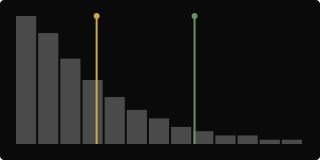
A histogram of how far price has been sitting from its own 200-period four-hour average, smoothed and filtered to cut out small noise. The marker shows today’s reading sitting well above the middle of its own history, with price trading above that average.
Takeaway: The trend has been running further from its average than usual, and the tape is on the upside of it.
Energy above the median — price below its 200-period average
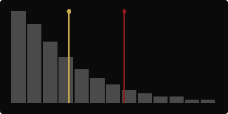
Same picture, other side: today’s reading is elevated against its own history, but price is trading below its 200-period average.
Takeaway: Same stretched reading, opposite side — the trend running further from average has been to the downside.
What
The 4H column shows a distribution histogram of how far price has been deviating from its own 200-bar four-hour average — the shape of that history, plus a marker for where today sits against it. It needs about 224 closed four-hour bars before it fills in, since it’s built on a 200-period average plus smoothing.
So what
Where today’s reading falls in this histogram tells you whether the current trend is running a normal distance from its average or has stretched further than usual. The marker’s tint just tells you which side of the average price is on right now — it isn’t a separate reading, it’s context for the same number.
Now what
A reading near the middle of the histogram is unremarkable — nothing about today’s trend distance stands out. A reading pushed out toward the edge is worth cross-checking against Sigma, which turns this same distribution into a single number — that’s usually the faster read once you know what the shape behind it looks like.